• PaintingBig
  • Patreon
  • Gallery
  • Find My Stuff!
  • WIP Blogs
Menu

PaintingBig

  • PaintingBig
  • Patreon
  • Gallery
  • Find My Stuff!
  • WIP Blogs
×

My WIP Blog has been a space for me to share some of my (often times previously unseen) work-in-progress shots on especially involved or otherwise interesting projects of the past. Often I’ll talk about colors or techniques I used on each project. I don't update this regularly, as it does take a large time investment to gather the materials and set things down in print, but I hope you enjoy seeing a bit of my process and reading some of my thoughts!

image.png

Leman Russ WIP Part 2

In Which There is Much Ado About Basing.

Leman Russ WIP Blog, Part 2

Painting Big January 13, 2019

Welcome to part two of my Forge World Leman Russ work-in-progress blog! I realized after I looked at my photo collection that I didn’t have too many photos to add, and most of them are about the basing, so this will be shorter than the last one. Here we go!

Here he’s still blue-tacked onto the base, and I’m getting a lot more done on the armor.

I blue-tacked Leman to the base pretty much for the entire period I was painting him. The pillar for the foot to stick in was nice and large, and he was actually quite stable that way. His 40mm base was also a comfortable size for me to hold for longer periods of time, so I didn’t feel the need to stick him on a separate miniature holder.

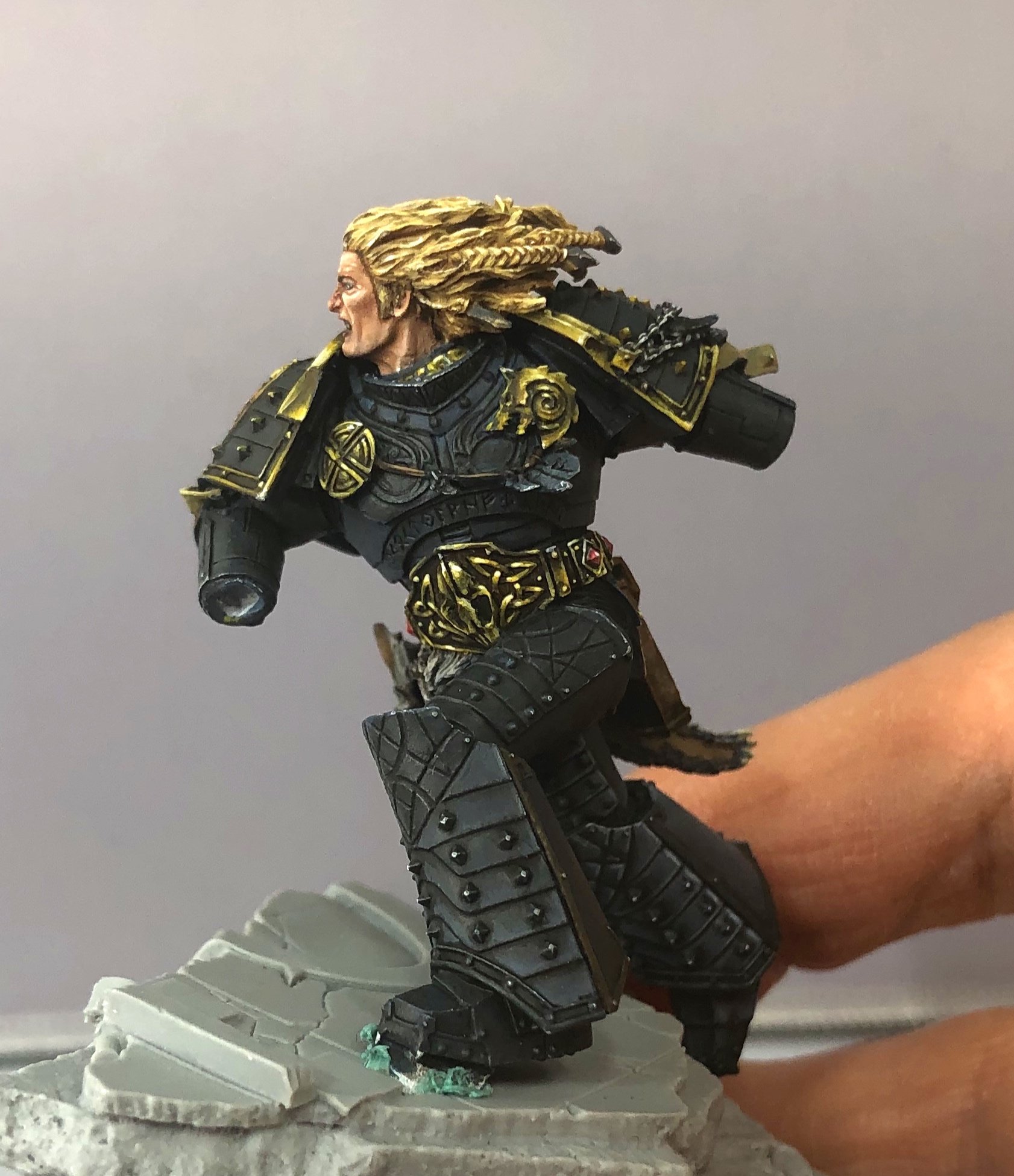
Here you can see I’m making a lot of progress on the armor. All those little sections took a long time to paint! Since Space Wolves are a bit darker in 30K, I started with a mixture of two Reaper colors, Carbon Grey and Glacial Mist. They’re from our latest Reaper Bones Kickstarter, and aren’t released just yet, but they will be a few months from now. Perks of being She Who Makes the Paint, that I get to use them early! ;)

Carbon Grey is a great charcoal grey color. I wanted something very dark but just light enough that a black wash would work well over it for my friends painting armies and models with lots of black. :) I love grey-blue colors, so Glacial Mist is one of those, very close to a traditional Space Wolf shadow color. From there I just mixed in a bit of white to make higher highlights.

Chest-on shot as I get even more of the armor completed.

Here’s a chest-on shot, which I really feel is his best angle to show off that elaborate armor. Last thing to do was to finish and attach the sword…

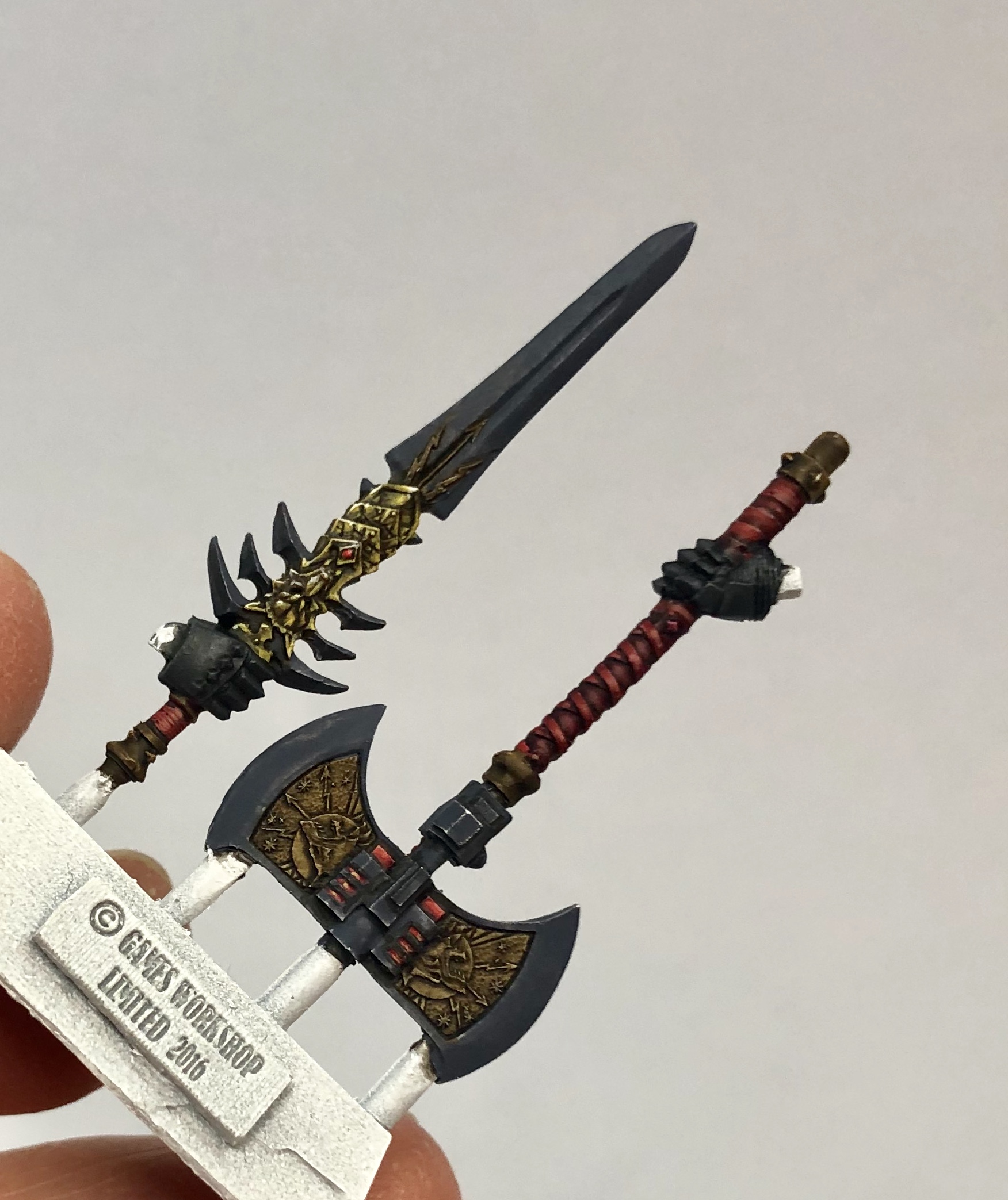
Sword attached, and base started! Now he can really murder some traitor Marines…

Sword done! I decided to do the sword in a more traditional steel, which makes it stand out better against the darker armor. Now that Leman himself was done and assembled, it was time to work on his base. Here’s a shot of that a little farther along.

Leman was painted with a total of about ten colors, so you could say that he’s painted in a “limited palette” paint style. When I needed an additional color, I tried to mix it with what I was already using. This technique can help to make your model look like it’s really integrated with the basing. Since I wanted to try not to introduce a lot of extra colors for the basing, everything is done utilizing the colors I used on Leman himself.

You can see this in the faded orange above. I wanted to highlight the Thousand Sons red more, and also to create random energy patterns foreshadowing their imminent fall to Chaos. Instead of grabbing an orange or yellow that I hadn’t previously used, I mixed my gold NMM highlight (Reaper MSP 9303 NMM Gold Highlight, in fact) into my red. This gave me a more muted or faded orange, but I kind of liked that because I didn’t want the base to be so bright that it would distract from Leman.

Smaller gaming base almost completed.

Here’s the smaller gaming base almost done. Now that you know I was mixing my stone colors with the paints I was already using, you can see where the red and yellow play in. The greenish-grey tones are made when grey (which contains black) mixes with the yellow pigments. The purple-blues are the same color I used for shading the lightning axe, the small axe blade on the back of the cape, and the initial cold shading on the cape itself, mixed with the Carbon Grey and Glacial Mist.

Gaming base complete! Almost done…

Leman finally glued down onto his complete gaming base. The only thing left to do was the outer base, which would be the same colors as the gaming one. There wasn’t a big obvious place to carry the red over for the Thousand Sons motif on the front side of it, so I ended up coloring the runes on the columns with touches of the red and orange.

Big Base In Place!

I was able to put more of the red/orange touches on the back where the scarab and Thousand Sons emblem were carved into the stonework.

From above. Love the dynamic composition of the model with the base. Everything done here except the parchment and one column!

DONE!

Leman complete! Achievement unlocked! I hope you’ve really enjoyed seeing the photos and reading the blog. Next up, I have some work to do on Leman’s dire wolf buddies! I’ll be doing an in-depth tutorial on at least one of those for my Patreon (patreon.com/paintingbig), probably with both text and video. Some WIP photos will end up on here, though, never fear. Stay tuned and thanks so much for reading!

16_NMM_belt.jpg

Leman Russ WIP Blog, Part 1

Because Space Wolves are cool in a wolfy sort of way

GW Forge World Leman Russ Work-in-Progress, Part 1

Painting Big January 6, 2019

Hey there! Welcome to part one of my Work-in-Progress blog on the Games Workshop Forge World Leman Russ model. This one is for the folks on the Warhammer Reddit who had such nice things to say about Leman. Thanks everyone! Now you get to see all the photos of how he came together. :)

Here’s the start of the cape! I base-coated in an off-white and then did a heavy wash of Reaper Mountain Grey from the Bones paint line.

Here’s the start of the cape! I base-coated in an off-white and then did a heavy wash of Reaper Mountain Grey from the Bones paint line.

The cape was the part I started with because I really liked the details on it and the shield. When I’m doing a complicated multi-part model like this, I find that if I work on the main body first, I get tired and really, really don’t feel like working on the accessory pieces after it, so instead I start with the accessories. That way I don’t get 30 hours in and really feel like I’m hating painting a sword…instead I just get to attach those finished parts near the end. Small psychological distinction, but when you know it’s going to take you a long time, you trick your brain in whatever way you can to keep going and keep excited about the project. :)

After I did the Mountain Stone wash, I kind of wanted a colder feel, so I took a promo Reaper color from this year’s ReaperCon, Black Indigo, and I did cold bluish shadows with it. At this point I was still thinking I wanted a frost wolf coloring, near white. I revised that very shortly, as you’ll see in the following photos.

Here’s the cape posing with its shadow color, Mountain Stone. :) Was easier to prop it up for the photo than to hold it!

Here’s the cape posing with its shadow color, Mountain Stone. :) Was easier to prop it up for the photo than to hold it!

I thought I wanted a frost wolf cape, but then realized that a pure white cape would be really distracting on the model. I didn’t think it would look very good, in the end, so I introduced some brown coloring in the part of the cape that would have been the wolf’s back. I also put in some really dark shadows behind the accessories and details, which helps to make them stand out later on. I think I used Reaper Master Series 9136 Walnut Brown for the dark shadows, but you could use any really dark brown. I don’t like to use pure black because it tends to make the model look cartoony and I wanted a more naturalistic look.

Highlighted the fur, glazed the whole thing a bit lighter, and painted the accessories.

Highlighted the fur, glazed the whole thing a bit lighter, and painted the accessories.

Finished cape!

Finished cape!

In the two photos above you can see progress on the cape. I highlighted the fur with an off-white, a couple of layers built up on top of each other, and then decided that the hairs stood out too much against the shadows.

You’ve got two choices when this happens; glaze to knock everything down darker or glaze to bring it lighter. A glaze is kind of like a thinned down wash, but you don’t let it pool; instead, you apply it thin and fast to put a thin layer of color down. It acts like a filter on a camera—it will bring everything under it closer together in the direction of the glaze.

Here, I decided to go with my original vision a bit, and glaze everything lighter. This made the shadows a little lighter, but everything still stood out okay, and it did make the clumps of hair blend in a lot better. Light glazes can be titchy because they can go streaky, and if you have to go back while they’re still wet you can screw everything up very easily! But I was lucky, and it all worked out.

The client had already requested NMM but I thought a straight silver axe blade would have disappeared into the cape, so I went with a darker cold steel look with a lot of blue in it.

To make a complicated model like this look good, I find that it’s useful to repeat the use of the main colors. So the color for the brown leather is also the brown I added to the fur of the wolf cape, and it’s repeated in the accessories and as a shadow for the NMM gold when it comes along. The red of the axe handle and gem I already knew I would be using for other accents around the model. Even the gold of the NMM shows up a little in Russ’s hair highlights, and all of these colors plus the armor colors are used to paint the base, so everything looks like it belongs together!

You could call this a “limited palette” painting style, where you try to do everything with a set selection of colors. I think that all told Leman only utilizes about ten colors. Maybe a dozen at most! There’s a lot of mixing.

Face detail.

Face detail.

I worked a bit more on the eyes after this and the hair, but the above is pretty much finished on the skin tones. Reaper MSP 9044 Tanned Skin is my go-to skin color base for almost everything; you can mix so many things into it to tune it one way or another, it’s extremely versatile.

Wolf Accessories!

Wolf Accessories!

Every good wolfing wolf has wolfy accessories, though these are less wolfy than many. :) Here again I’m repeating colors, the red and the browns and the golds. I do paint this sort of stuff on the sprue to give myself something to hold onto. I could clip them off and mount them on wires, but I find it’s just handy to use the sprue. These Forge World sprues were nice and beefy and easy to hold onto, and the contact points were well-placed and easy to clean up.

Starting the axe, the handle wrap and NMM on the geometric side.

Starting the axe, the handle wrap and NMM on the geometric side.

Gold NMM on the sword, close-up.

Gold NMM on the sword, close-up.

Weapons are my least-favorite thing to paint, so I wanted to get those taken care of so I could get to the fun part—Leman himself! On the previous two photos you see me setting up the gold NMM. It’s worth mentioning at this point that the NMM on this model, taken in total, was easily 15 hours of work by itself!

So, shortly after I took the above photo I fitted the axe onto Leman’s arm and realized—wait. What do you mean, the cool wolf-head detailing is on the UNDERSIDE of the axe?!?

I immediately decided to slice the axe head off and reposition it so the awesome wolves were on the upside and not hidden. :)

I’m afraid that I didn’t even check with my client before I did it, either, because I knew that More Wolf was Better Wolf…at least I hoped so.

NMM on the cool wolfy heads, and more on the sword.

NMM on the cool wolfy heads, and more on the sword.

I started really dark on the sword and axe blades because I wasn’t yet sure what I wanted to do with them, but that would shortly be resolved. I do this a lot—kind of go in and just wait for a good idea to come along, and then run with it. It makes the model more fun for me to paint to not quite be sure where I’ll end up sometimes!

Shield and cape together.

Shield and cape together.

Shield and cape blue-tacked on to check fit.

Shield and cape blue-tacked on to check fit.

I’m afraid I managed to delete my work in progress shots of the shield! But above you can see it complete, and I tacked it on to check the fit and the look, to see if I liked it. After that, I figured since I was already working on the gold NMM on the weapons, I should use the colors I had mixed and work on the armor!

The detailing on the armor on this model is just flat-out fantastic. Hellish to paint, but fantastic. You hate it, and you love it, and you really can’t decide which you feel more until you start humming Fenrisian battle hymns under your breath.

The detailing on the armor on this model is just flat-out fantastic. Hellish to paint, but fantastic. You hate it, and you love it, and you really can’t decide which you feel more until you start humming Fenrisian battle hymns under your breath.

Got through a bunch of the leg and chest and shoulder stuff, couldn’t resist tacking his head on to see how it all looked!

Got through a bunch of the leg and chest and shoulder stuff, couldn’t resist tacking his head on to see how it all looked!

So here you can see I’m playing with the highlights on the leg armor to settle on my colors for the main body of the piece, and I’ve blocked in a lot of the shoulder pad colors in addition to working on a lot of the NMM gold. Notice that I’ve also lined the model—put dark lines in around all the little details. Doing this now means I can be a little messy with it, and I can neaten them up later with highlights. :)

Side note: I really loved doing the little wolf head broach piece there on his chest. What a great little detail!

Leg armor and blocking in the wolf pelt and head on the hip.

Leg armor and blocking in the wolf pelt and head on the hip.

Now stuff started really coming together because I was starting to be able to attach the accessory pieces. This is where I get excited because I can really visualize how the model will look finished and that keeps me going!

Here’s a succession of photos where you can see the pistol get attached in its holster, the fantastic belt detailing finally coming together (I won’t even tell you what a pain it was to paint that in NMM…but I ended up loving it), and then the finished pelt and head on the hip.

Holster on! Now he can shoot someone! Well, he could if he had hands. D’oh.

Holster on! Now he can shoot someone! Well, he could if he had hands. D’oh.

Belt NMM not for the faint of heart. Don’t try this at home, kids.

Belt NMM not for the faint of heart. Don’t try this at home, kids.

Little better picture of the pelt and head.

Little better picture of the pelt and head.

I was so happy to finally be attaching things I figured it was time to figure out what I wanted to do with the axe. In messing around with the blade I was thinking maybe frost, but I liked it better painted dark steel like the small axe on Leman’s back. Then I was like, wait, it’s a power axe…IT NEEDS LIGHTNING (so it got lightning).

Testing the fit before I snip it off the sprue!

Testing the fit before I snip it off the sprue!

A little blurry here, but you can still see it.

A little blurry here, but you can still see it.

“…and my axe!!”

“…and my axe!!”

Axe attached! Mission accomplished! Blog post finished!…well, for the moment!

I hope you guys have enjoyed this! I didn’t realize how many work-in-progress photos I’d taken until I was downloading and editing them all, and I have a bunch more, so I decided I’d split this into two posts and put up the other one tomorrow. :)

Have a very wolfy evening and do check back for part two!

—Anne ;)

In paintinglittle Tags Forge World, Leman Russ, Games Workshop, Space Wolf, Warhammer 40K
27_blue_allstages.jpg

Soldier WIP Part Two!

Wherein we tackle lots of leather.

Overwatch Soldier:76 Work-in-Progress, Part Two

Painting Big January 6, 2019

Welcome to part two of my Overwatch Soldier:76 Work-in-Progress blog! Be sure to check out part one if you missed it. :)

A close-in detail of the glove.

A close-in detail of the glove.

Above you can see a close-in detail shot of one of the gloves. Red is one of my favorite colors to paint! After all this was done, though, it was time to finally figure out what the heck I was doing with the rest of the jacket leather. I went looking for reference photos.

It’s always best, when you’re trying to duplicate something from real life, to find photo references. I’m always amazed when I see people try to do something like paint an animal without looking for a good reference photo.

In this case, what I was looking for were photos that would help me understand the pattern of the particular leather I wanted, so that I could try to duplicate the visual effect. Here are a couple of the photos that helped me:

This one was useful for studying the seams.

This one was useful for studying the seams.

This one really helped me understand how to break down the pattern, and it was even a jacket, so it was a perfect reference. :)

This one really helped me understand how to break down the pattern, and it was even a jacket, so it was a perfect reference. :)

Once I had those references, I tried a couple of different ways to do the leather. I liked the effect I was getting on the cuffs so I decided to go with that for the rest of the dark grey leather, and also on the red and white leather. I wanted them to look like a different type or softer finish.

Below you can see the various stages of the grey. You can see on the bottom where I’ve blocked out larger sections with implied creases in the leather. I did try to make many of the creases follow where they would naturally appear with wear, but a lot of creases in leather come from the original animal’s structure, so many don’t align that way. The middle section I’ve painstakingly mapped in the detail. Yes, each of those little irregular dots is hand-painted. Don’t even ask how long it took me! The darker top part, with softer detail, has received a glaze of Reaper MSP Brown Liner. This is a translucent, near-black paint that’s good for darkening and shading with glazes and washes.

I suppose this is where I give a shout-out to the brush that got me through all this. It survived all of the leather and then took another four months of painting before it finally died in glorious combat with some extreme freehand (maybe I’ll post about that project in the future!). The brush I use for all of my high-end painting is a Kolinsky sable brush (Kolinsky is the highest grade of sable). I use the DaVinci Maestro brand, Series 10, size 1. This is a longer, tapering round with a razor-sharp tip. Though it’s a size 1, it’s smaller around than many brushes of that size, and I can do anything with it, even the tiniest eyeballs. Even with the abuse I heap on it, one of these will last me easily nine to twelve months of painting 10 to 20 hours a week and it’ll never lose that wonderful sharp point. So if you don’t paint as much as I do, think about how long it will last you! $16 might seem a lot for a brush, but when it lasts you that long, and performs that well, for me it’s worth it. :)

28_grey_allstages.jpg
Starting on the back.

Starting on the back.

Above, you can see the start of the back leather on the coat. The red and yellow panels were mostly too thin to try to do the larger texture I used on the blue, so I stuck to the very small dots for those. I did go with the larger pattern on the red part of the “76”, though, because I wanted it to really stand out. :)

Here below I started to map out the blue and you can see the various stages this particular texture goes through. Instead of just filling space with irregular dots, I’m mapping out a pattern (it’s kind of like drawing endless drunken spiderwebs, really), and then highlighting within each section of that. I ended up really enjoying this texture and will absolutely use it on a Patreon video project in the future to show you guys how I do it in real-time!

Mapping out the blue, all stages visible.

Mapping out the blue, all stages visible.

So again in the bottom section you see I’m starting by delineating larger sections between creases, then taking each of those sections and doing another grid (more drunken spiderwebs!) and then highlighting each little bit, at least a couple of highlights, and then highlights for each of the larger sections to make it all look three-dimensional. My shadows overall I ended up keeping very subtle, just glazing in sections with Brown Liner. The reason for this is that on a larger sculpture like this, the model will cast its own natural shadows. This means if you try to make very dark shadows, as you would on a small 28mm miniature, they’ll look unnatural or wrong, or like you’re trying to depict very harsh lighting.

This is actually true not for just huge statues but for any miniature that’s large, starting around 72mm scale. So when you’re working big, try going for more subtle shadows and see if you like the effect. And hey, it saves you work, too!

Blue sleeve, complete! Whew. That was a LOT of work, but I saved the jacket for last because I was really excited to work on it, so I really didn’t mind. :)

Blue sleeve, complete! Whew. That was a LOT of work, but I saved the jacket for last because I was really excited to work on it, so I really didn’t mind. :)

Here’s the start on mapping in the red on the 76. The red strips along the side were too small to go with the spiderwebs effect, but the numbers were big enough and I was really happy with the effect!

Here’s the start on mapping in the red on the 76. The red strips along the side were too small to go with the spiderwebs effect, but the numbers were big enough and I was really happy with the effect!

So above, you can see the red being mapped in just like I did with the blue. I went back and forth on the red highlights. At first I thought I would use orange and yellow, because I’ve always kind of not liked highlighting red with pink. But when I tried the orange, I realized I wasn’t a fan. It was too close to the yellow, and wasn’t a strong enough highlight to really make the leather pop. I realized that if I highlighted with pink, but then put a glaze (kind of like a really weak wash) of bright red over the top, it would knock down the pink effect and also blend in my highlights. So I tried that, and it worked! My glaze color was Reaper MSP 9094 Clear Red. The Clear MSP colors are really good for this sort of thing—for glazing to make a color brighter or more vibrant or to make blends and highlights look smoother. Here’s another shot of the jacket back, almost done.

Jacket leather, almost done!

Jacket leather, almost done!

At this point I was so close I could taste it—and also, I was almost at my deadline! I wanted to enter Soldier into the ReaperCon Master Series Open painting competition. I managed to make it, BARELY, an hour before the deadline, after getting up early to work on him every day of the Con leading up to Saturday’s deadline!

Soldier scored a Gold medal, my first at ReaperCon. Previously I hadn’t felt inspired to really give an entry everything I had, and I also work for Reaper so I wasn’t sure I should enter. But I was so excited about Soldier, and I’d worked so long on him (two years!) and I loved how he came out. I had to enter him, and I’m so glad that I did. You can see his finished photos on the front gallery page of my site here. :)

So after all that, you’d think I’d be done with painting gigantic Overwatch statues wouldn’t you? Any sane person would be…

Yeah. Well. Tracer statue repaint, coming soon to a Twitch channel near you. Watch this space, I’ll post about it when I start up the Tracer on Twitch. :)

(I told myself I couldn’t buy the Hanzo till I painted Tracer…a girl’s gotta do what a girl’s gotta do!)

I hope you enjoyed this work-in-progress blog! Stay tuned for a new entry featuring WIP photos of the GW Forge World Leman Russ I recently completed. And remember, I have a brand new Patreon where I’m going to be sharing written and video tutorials on a bunch of new projects, and it’s FREE for the month of January! You won’t be charged till February 1st. You can find it here: the PaintingBig Patreon!

In Overwatch, paintingbig Tags Overwatch, Soldier76, Statue, 1/6th scale
9_Soldier_necktexture.jpg

Overwatch Soldier:76

Welcome to Part One of my work-in-progress gallery (plus commentary) for Soldier!

Overwatch Soldier:76 Work-in-Progress, Part One

Painting Big January 1, 2019

It feels like I’ve been wanting to do this for AGES and the day is finally here—it’s time to put up all my work-in-progress photos of my Soldier:76 Overwatch statue! All through the time I was working on Soldier, but especially over the final year, I kept a good series of photos as I went along. I did this originally to share with my friends and Discord community to keep myself motivated, but as a result it’s given me an excellent archive of how the project developed over the months. I hope you’ll enjoy the photos!

Read More
Tags Soldier76, Overwatch, Statue, 1/6th scale

POSTS BY MONTH

  • January 2019 4

Powered by Squarespace